
When did Monochrome Art Become So Popular?
We all love monochrome colour schemes. They’re Timeless, sleek, and effortlessly trendy. But, when did our obsession with black and white begin?
Just think about it. Until one hundred years ago, paintings were realist. Artists attempted to replicate life as much as possible, which of course meant using colour. Then, around the start of the twentieth century, something changed. Designers found alternative ways of expressing themselves. This included abandoning the rainbow for something simpler. The reign of monochrome began!
So, let’s take a look back at how our use of black and white has grown over the past one hundred years. And, stick about until the end to see Project Nord’s own monochrome poster designs. Here we go!

Piet Mondrian, Composition IV, 1914
Monochrome in CUbism
Early artists from the cubist movement were the first to drain their works of colour. Instead of being realist, cubism sought to emphasise shape and movement. Therefore, colour was often left out.
Mondrian was one of the first artists to experiment in this way. Between the years 1912 and 1915, colour slowly dropped out of his paintings. It wasn’t until 1917 that he switched his process and started painting in the style we recognise today.
Monochrome in Suprematism
The Russian Suprematist movement was founded my Kazimir Malevich in 1913. It focused on painting geometric forms in limited colour schemes. Many argue that this movement was the very first incarnation of minimalism.
The painting pictured, White on White, was the start of something very new. There’s no sense of colour, depth, or volume. It’s not symmetrical. The lines are not even precise. And yet, the painting certainly says something to the viewer. Malevich used textured brushstroke to make the smaller square feel as if it was floating from the canvas. He used white to symbolise infinity and the skewed composition is said to show movement.
This painting represented many things to the art world. Realist representation had been abandoned. Abstraction had begun. Suddenly, a monochrome colour scheme said more than all the colours in the rainbow.

Kazimir Malevich, Suprematist Composition: White On White, 1918

Frank Stella, Die Fahne Hoch!, 1959
Monochrome in Minimalism
A few decades passed before such simplified compositions took centre stage again. It was in 1959 that Frank Stella created his ‘Black Paintings’. He abandoned the tradition of sketching pieces out ahead of time. Instead, he took brush to canvas and just went for it. As he said at the time, a painting was;
‘a flat surface with paint on it – nothing more…’
His approach was straight-forward, and so was his choice of colours.
Stella’s work was the precursor to the whole world of minimalist art. Out of this movement came paintings which did not try to replicate anything. They were simply art objects themselves. So, it makes sense that colour rarely featured.
If you would like more information on minimalism, we have a whole article dedicated to it! Check it out here.
Monochrome art is timeless
It’s amazing that the painting above came from such different art movements, and yet they all look timeless. That’s why we think monochrome pieces make great home decor choices! They’re easy to style and stay with you for a lifetime.
Here’s some of our favourite monochrome posters from Project Nord. What do you think?
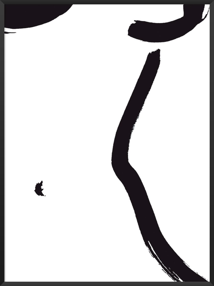
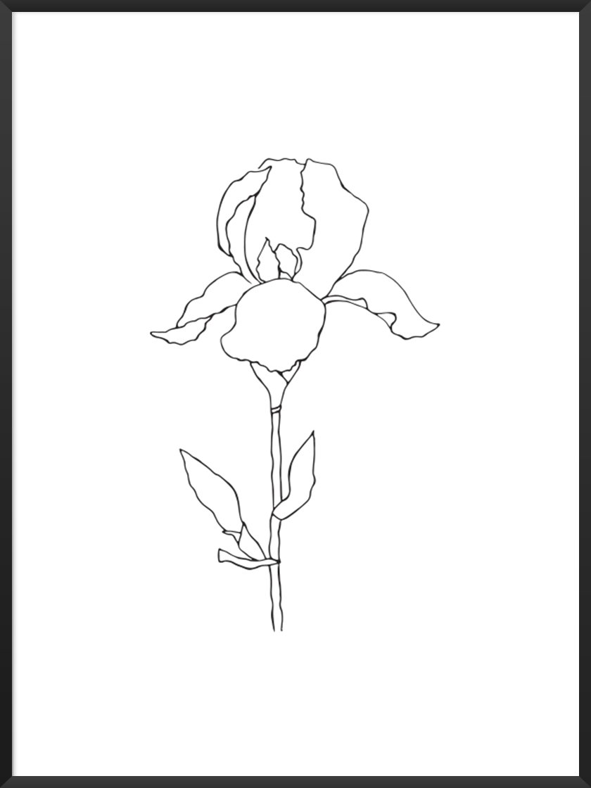
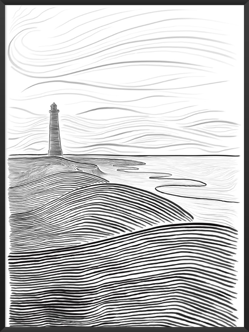
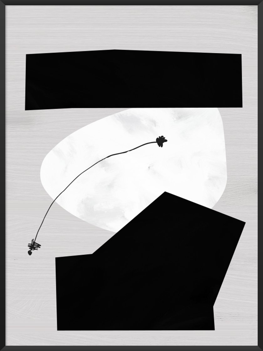
We have a huge collection of monochrome posters here at Project Nord. Take a look if you’re interested in creating a timeless and effortlessly cool home that will never go out of style. Show us what you came up with my tagging us @project.nord on Instagram!
Images sourced from Pintrest and Project Nord website.